Arilo

Creativity, with conviction.

Our studio’s own site. Art-directed end to end, built with an AI agent.

Visit the siteRead the story

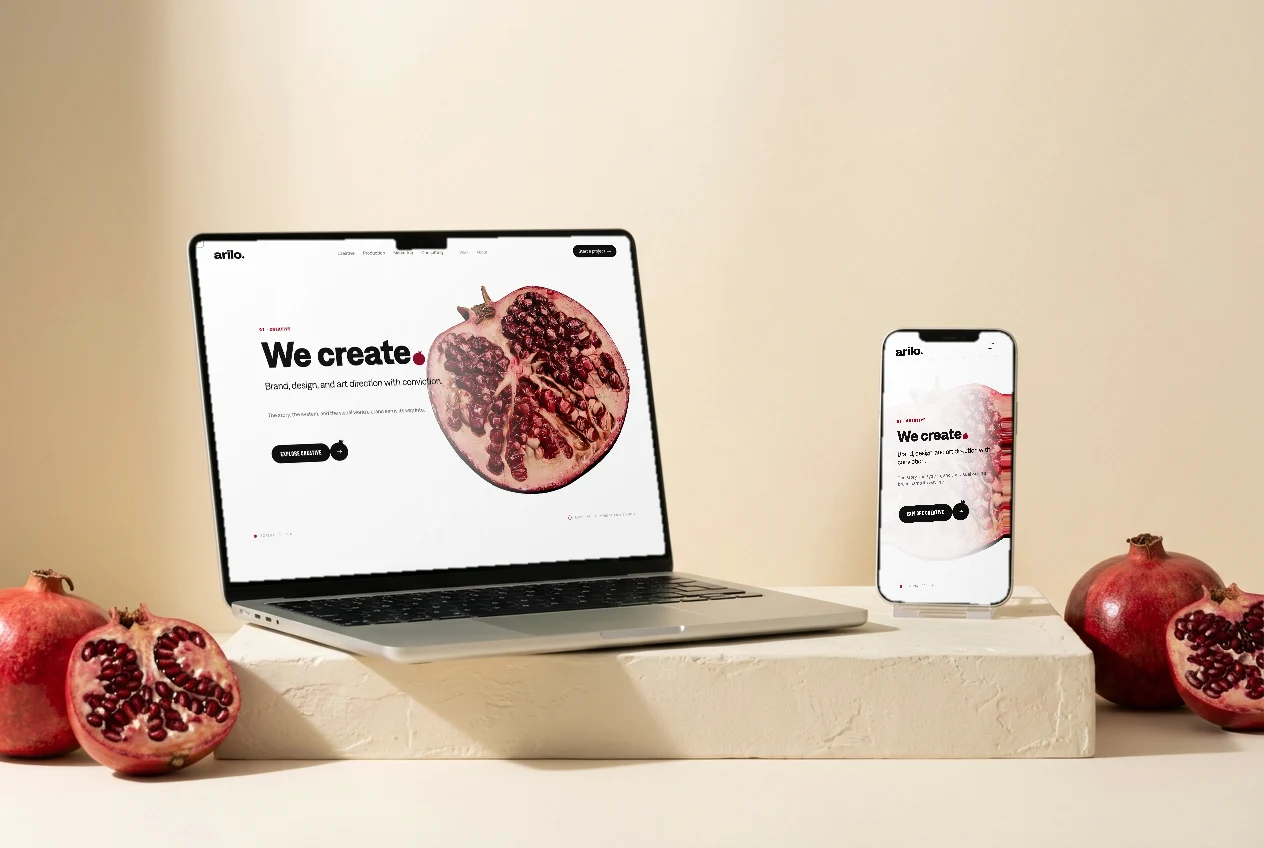
Arilo homepage — “We create.” beside the real-time 3D pomegranate hero
What
The studio · Brand site, art-directed & AI-built
Role
Creative direction, brand system & art direction — an AI-native build I directed end to end
When
v1 May 2026 → ongoing · Live
Live
arilo.co ↗
  • Next.js 14
  • React Three Fiber
  • GSAP + ScrollTrigger
  • Brand & motion system
  • AI-directed build

The brief

Arilo sells creativity, technology, and execution to enterprise CMOs — L’Oréal-tier buyers who judge an agency by its own site before they read a word. The brief was “AI-native + craft,” never a generic agency template: the site had to demonstrate the studio, not describe it.

So I built it the way the studio delivers. Rather than hand-coding line by line, I wrote prescriptive markdown briefs — exact design tokens, the components to reuse, the routes, the acceptance criteria — and ran an AI coding agent (Claude Code) end-to-end against them, verifying in-browser and iterating in small, single-purpose art-direction passes. The craft is in the direction: the brand system, the motion language, and the taste calls on every revision.
How we did it.

4 steps, from brief to launch.

  1. 01

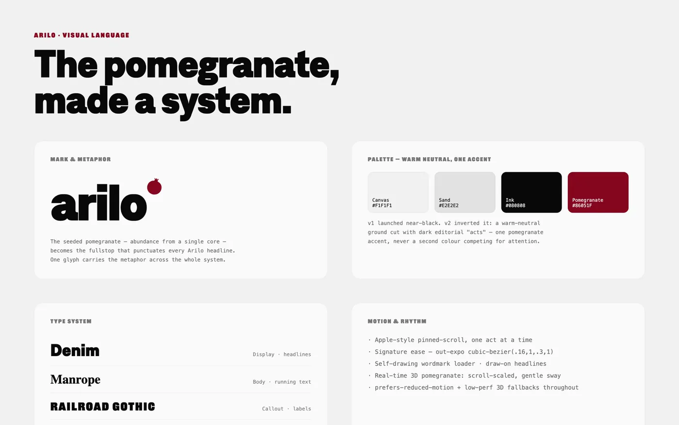
    Develop the visual language from the metaphor

    Start with meaning, not a mood board.

    The pomegranate — abundance from a single seeded core — is the brand’s whole idea, so it became the literal fullstop that punctuates every Arilo headline. From that one mark the system radiates: a warm-neutral canvas (#F1F1F1) cut with dark editorial “acts,” a single pomegranate accent (#86051F) that never shares the stage, and a four-face type system — Denim display, Manrope body, Railroad Gothic callouts, JetBrains Mono for data.

  2. 02

    Lighten and structure it (v1 → v2)

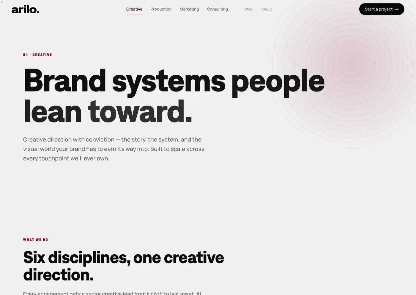
    Kill the 2018-agency darkness; give buyers the map.

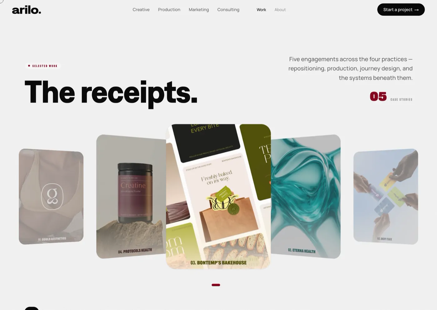
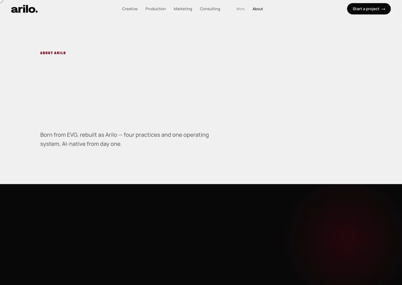
    v1 launched near-black; it read as trope. v2 inverted the ground to warm neutral with strategic dark acts, and restructured the IA around four service pillars — Creative / Production / Marketing / Consulting — with AI living inside each, not as a standalone novelty.

  3. 03

    Put a real pomegranate in the browser

    Make the brand mark a live 3D object, not a picture.

    It evolved from a procedural icosahedron to the real fruit — USDZ → GLB, then re-textured from FBX with PBR transmission on the seeds, clearcoat wet-shine, and a leathery normal map. One React Three Fiber scene serves the site (scroll-scaled, gentle sway) and the pitch deck (autorotate).

  4. 04

    Choreograph the scroll

    Motion as the argument, not decoration.

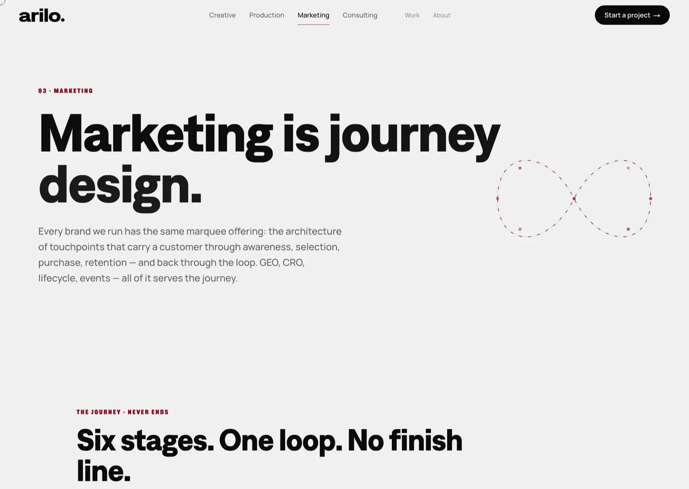
    An Apple-style pinned-scroll homepage, GSAP + ScrollTrigger sequences on the signature out-expo ease, a self-drawing wordmark loader, draw-on headlines, and the Marketing page’s infinity-loop journey — the “customers never convert” thesis made visual — all with prefers-reduced-motion and low-perf 3D fallbacks.

The result

The studio’s site as its own strongest case study.

Livearilo.co
4Service pillars + case-study engine
1System → site, RFI microsite & deck
  • A hand-directed, AI-native Next.js build — the medium proving the studio’s “AI + craft” message.
  • A visual language derived from one idea: the pomegranate metaphor → the fullstop mark → the whole system.
  • One design system stretched across the marketing site, a no-index L’Oréal RFI microsite, and a click-advanced capabilities deck.