DeFi Tax

Crypto tax, made clear.

A rebuild where colour does the work: green for structure, blue for protection.

Read the story

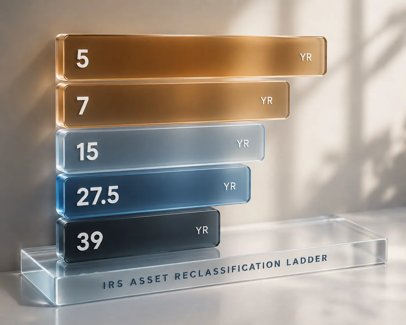
DeFi Tax illustration — IRS asset reclassification ladder
What
Crypto tax & compliance platform · Rebrand & site
Role
Creative direction, wireframes & design QA — with the Arilo / EVG studio team
When
2025 — 2026
  • Brand direction
  • Wireframes
  • Illustration set
  • Design QA vs dev

The brief

Blockchain transaction data, audit-readiness, traceability, and financial reporting — sold to founders, operators, and CPAs who think in very different vocabularies. The old messaging assumed the reader already understood the problem.

The rebuild reframed the platform around what it removes: risk, manual reconciliation, audit anxiety. I set the colour logic on the record — green for structure and clarity, blue for calm and protection, purple for industry authority — and built an illustration system to carry it.

How we did it.

3 steps, from brief to launch.

  1. 01

    Direct the rebrand

    Give the platform a defensible visual position.

    Brand direction and full site wireframes — the creative owned in-studio while WordPress development ran with an external team.

  2. 02

    Illustrate the mechanism

    Draw what the platform actually does.

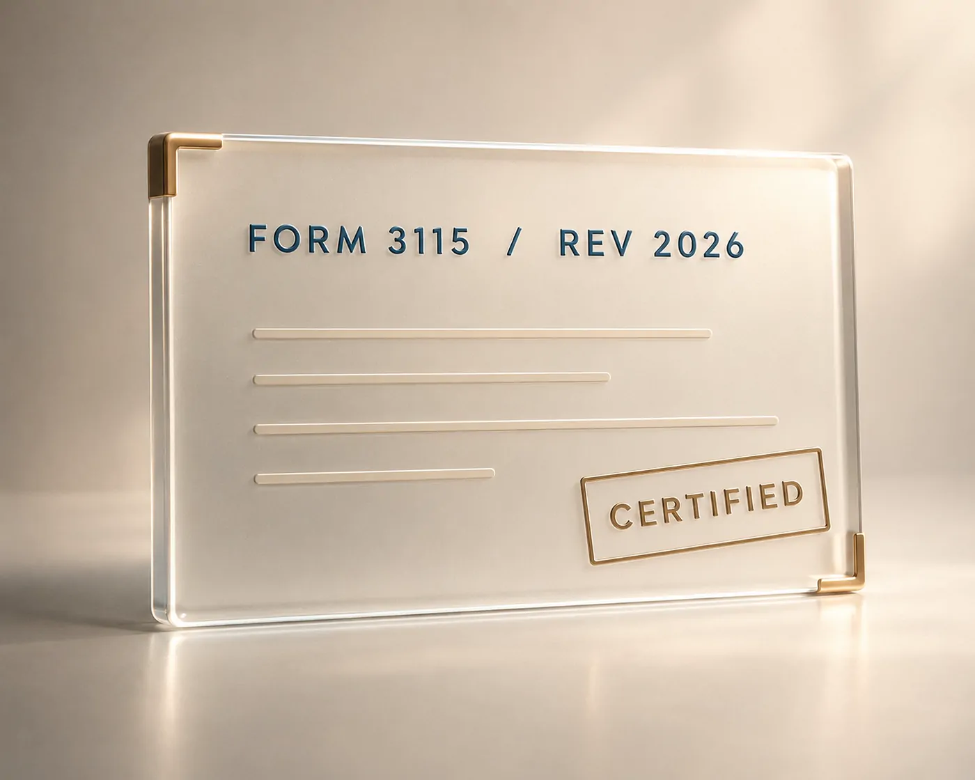
    A custom illustration set — the IRS asset reclassification ladder, compliance, defense, oversight — that explains audit-readiness visually instead of in jargon.

  3. 03

    QA the build, test the message

    Hold the shipped product to the design.

    Design QA cycles against the development build, plus A/B testing on the hero visual directions to let the audience pick the metaphor.

The full sets.

1 set, every piece sized for where it lives.

The result

Complexity translated into a visual system with a point of view.

4Illustration systems: ladder · compliance · defense · oversight
3Colours with jobs: structure · protection · authority
A/BHero directions audience-tested
  • A colour strategy stated plainly enough to survive a boardroom: green = structure, blue = protection, purple = authority.
  • Custom illustrations that explain audit-readiness without a paragraph of jargon.
  • Design QA against the dev build — the shipped pages held to the wireframes.