Equip The Future

Proof first.

A nonprofit site redesigned to lead with proof.

Visit the siteRead the story

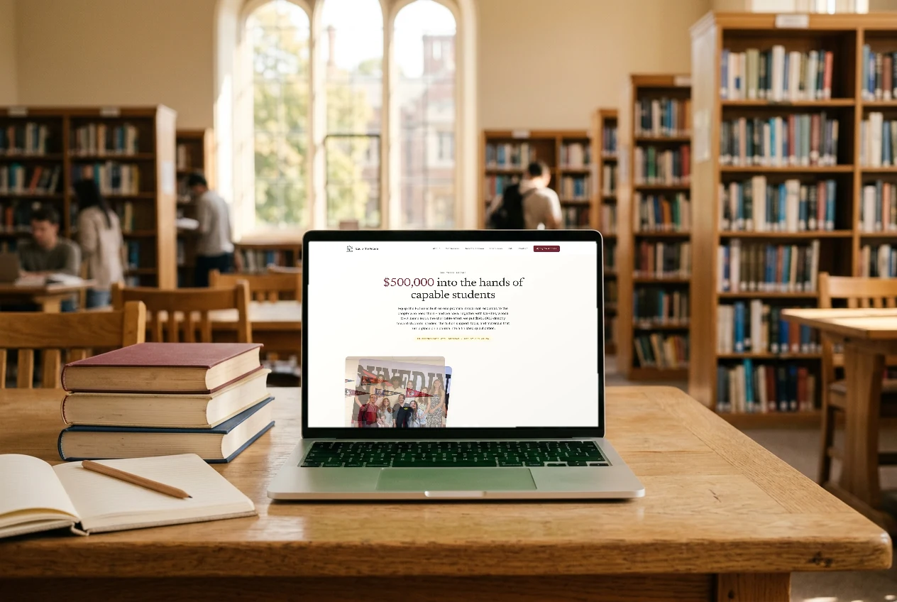
Equip The Future v2 redesign — “$500,000 into the hands of capable students”
What
Nonprofit · Brand & web redesign
Role
Brand & web design (v1 + v2 redesign) — for United Hope Network, with the Arilo / EVG studio team
When
2026 · v1 live · v2 redesign rolling out
Live
unitedhopenetwork.net ↗
  • Brand guidelines
  • Logo system
  • Web design
  • Editorial art direction
  • Content strategy

The brief

Equip The Future serves two people who want opposite things: a learner asking “can this actually help me finish?” and a donor asking “can I trust where this goes?” The v1 site answered both by splitting into two lanes — but its impact and testimonial sections were built to stay empty on purpose, because inventing proof for a charity is the one unforgivable thing.

By the v2 pass, the proof was real: the organisation reports a $500,000 donation from partner DeFiTax put directly toward students’ studies, and its first cohort of recipients. So the redesign inverts the site — it now opens on “Our Track Record” and leads with the numbers and the people, in a warmer, more editorial voice.
How we did it.

4 steps, from brief to launch.

  1. 01

    From proof-hidden to proof-led

    Let the redesign be driven by real outcomes, not a facelift.

    v1’s honesty rule (no invented figures, sections empty until real) held the line; v2 fills them — the homepage now opens on the reported $500,000 DeFiTax donation and the first recipient cohort, attributed to the organisation, never inflated.

  2. 02

    Shift to an editorial voice

    Make a charity read as credible, not scrappy.

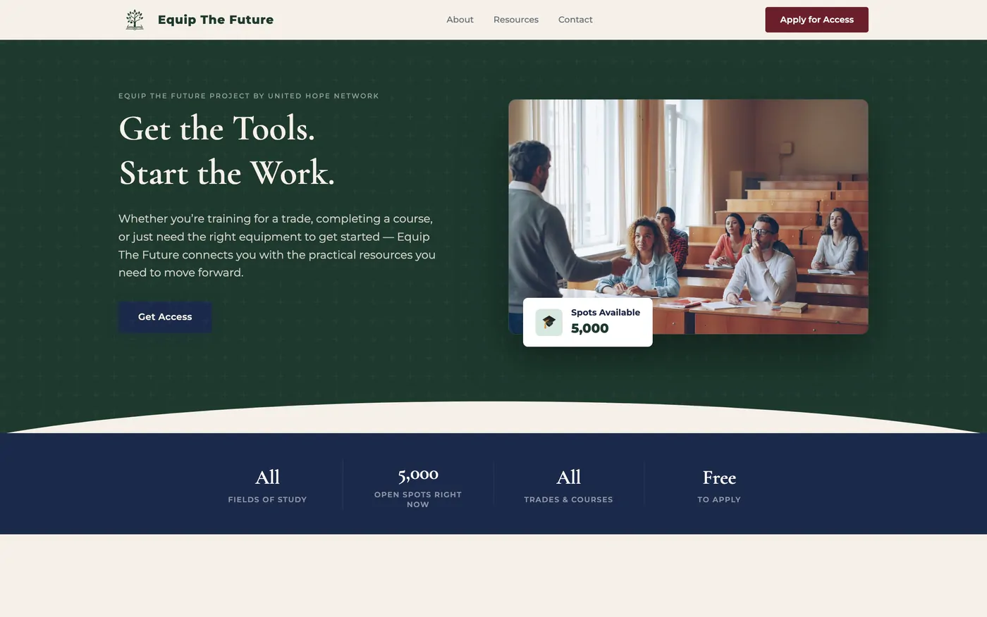
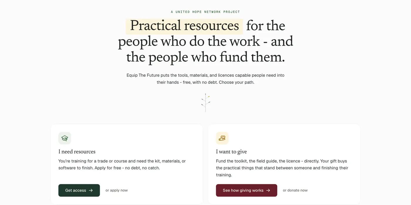
    A serif display face, a warm cream ground with a heritage-green “act” and a single maroon accent, and a highlight-marker device on key phrases — dignified, human, and a clear step up from the v1 system.

  3. 03

    Sharpen the two paths

    One page, two front doors, no dilution.

    “Practical resources for the people who do the work — and the people who fund them” splits into an “I need resources” lane (green, Get access) and an “I want to give” lane (maroon, See how giving works), each with its own proof and CTA.

  4. 04

    Make the offer legible at a glance

    Answer the practical questions before they’re asked.

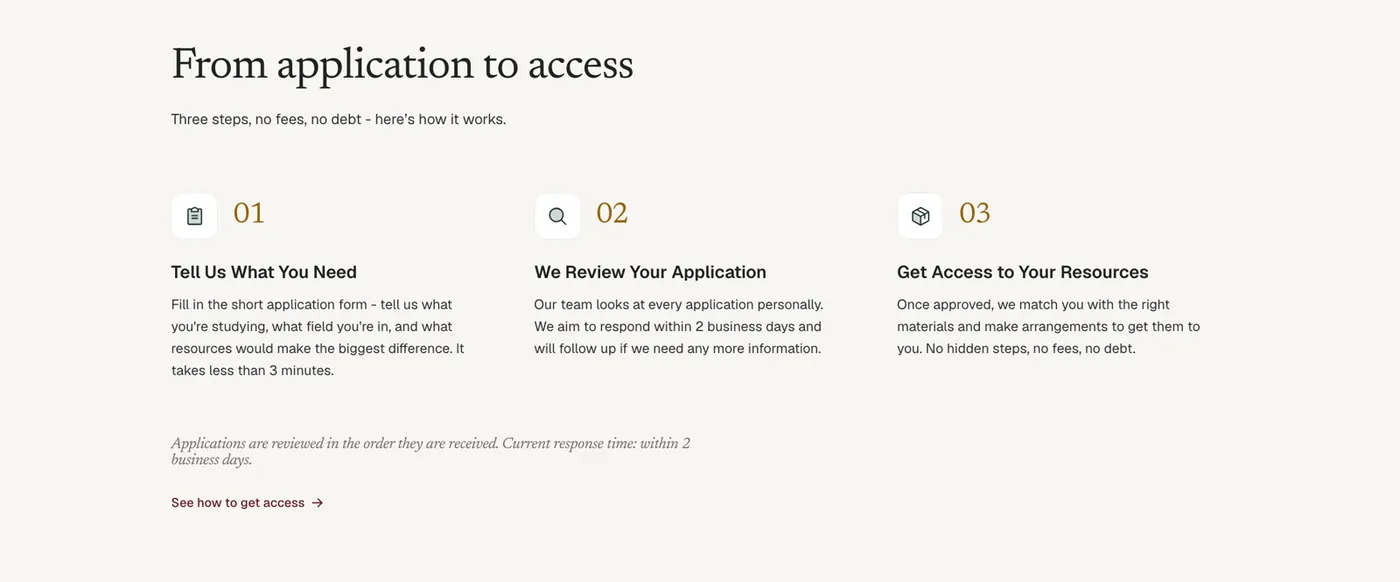
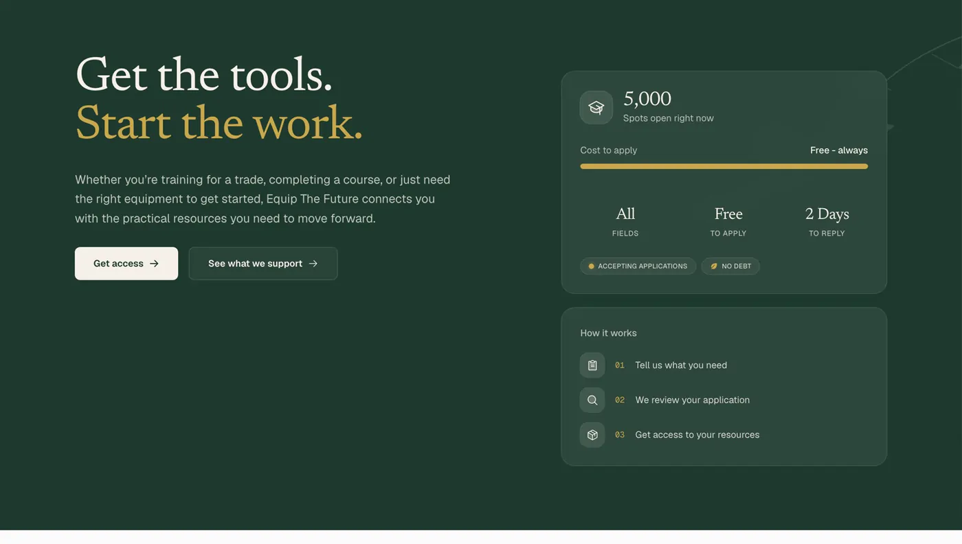
    A stats card — spots open, free to apply, all fields, two days to reply — plus a three-step “how it works,” so a working learner sees the whole deal without scrolling into fine print.

The result

A redesign that earned the right to show its numbers.

v1 → v2Proof-hidden launch → proof-led redesign
$500KDeFiTax donation — the organisation’s reported figure
2Paths: I need resources · I want to give
  • The v1 honesty rule paid off: because nothing was faked at launch, the v2 proof section is entirely real and attributable.
  • A full editorial redesign — serif art direction, warm palette, proof-first IA — carried on the same brand foundation.
  • Two-audience architecture kept intact and sharpened, so donors and learners each still get their own front door.