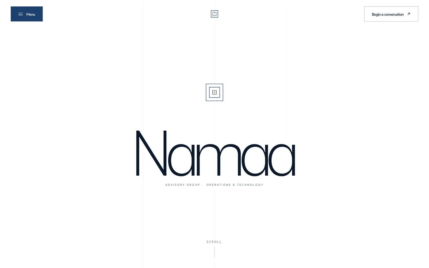
Namaa Advisory

Growth deserves structure.

An identity built on nested squares, in navy and gold, for Latin and Arabic.

Read the story

Namaa Advisory Group — wordmark and nested-square identity
What
Operations & technology advisory · Identity & site
Role
Identity & site design — with the Arilo / EVG studio team
When
2026
  • Identity directions
  • Name mark
  • Web design
  • Bilingual typography

The brief

Namaa (Arabic for “growth”) advises on operations and technology: custom platforms, portals, API integration, and workflow automation. The brand needed to read as structured and senior in both English and Arabic contexts.

The identity directions built the name’s meaning into the system itself: nested squares as the mark — growth with structure — with an editorial serif/sans pairing chosen alongside an Arabic-capable typeface for future localisation.

How we did it.

3 steps, from brief to launch.

  1. 01

    Explore identity directions

    Give the client real, distinct options.

    Identity directions presented as full concepts — mark, type, colour, and application — rather than variations of one idea.

  2. 02

    Build meaning into the mark

    Make “growth deserves structure” visible.

    The nested-square name mark grows outward in ordered increments — the strategy expressed as geometry, in deep navy with a gold accent.

  3. 03

    Design the site system

    Carry the identity onto the web.

    A site design with editorial typography, generous grids, and choreographed motion — with type choices (including Arabic-capable faces) made for eventual bilingual delivery.

The result

An advisory brand whose geometry argues its strategy.

EN + ARTypography planned for two scripts
Navy · GoldNested-square identity system
2026Identity & site directions delivered
  • A name mark that encodes the positioning — growth, structured.
  • Typography system selected for bilingual (EN/AR) delivery from day one.
  • Identity and site directions delivered as one coherent package.